
Seasonal Color Palettes: Spring/Summer 2026 Trends
As we step into Spring/Summer 2026, color is taking on a luminous, expressive quality—balancing softness with vitality, and earthiness with unexpected brightness. This season’s palette feels alive: sun-warmed, ocean-washed, and effortlessly wearable across all ten seasonal color families.
Let’s explore the defining shades for each palette:
True Seasons
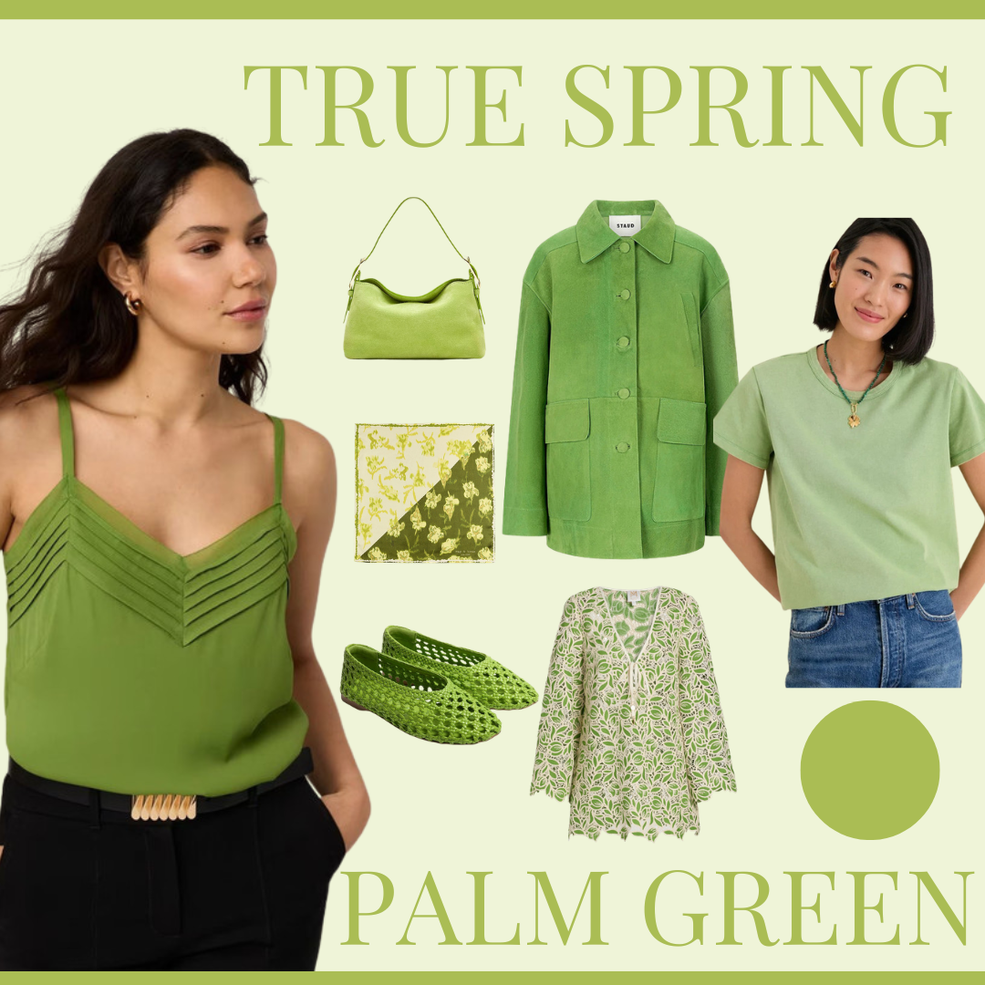
True Spring: Palm Green
Palm Green captures the lush vitality of sunlit foliage—fresh, warm, and full of life. This yellow-based green feels energizing without being overwhelming, making it a natural statement color for True Springs. Wear it in breezy dresses, relaxed knits, or even accessories to instantly awaken your look. It pairs beautifully with warm neutrals like cream and camel, or can stand confidently on its own.
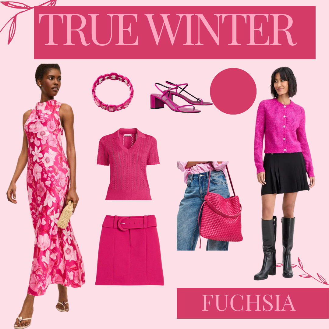
True Winter: Fuchsia
Fuchsia brings a bold, electric edge to the True Winter palette. This cool, high-impact pink is both playful and commanding—perfect for making a statement while staying aligned with Winter’s crisp clarity. Whether in a sleek dress, tailored top, or a saturated lip, fuchsia delivers instant polish and presence.
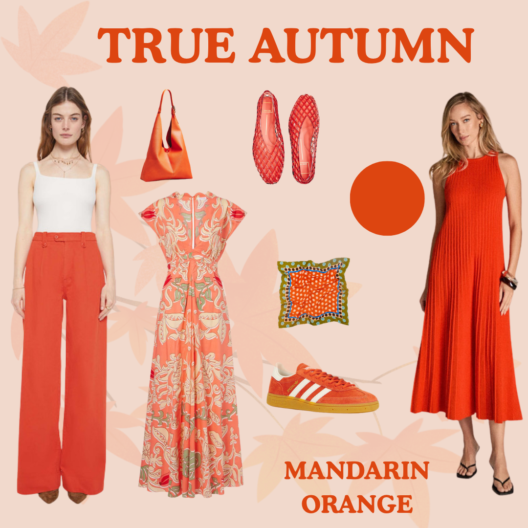
True Autumn: Mandarin Orange
Mandarin Orange radiates warmth and richness, echoing the glow of late afternoon sunlight. This saturated, golden orange feels grounded yet vibrant—ideal for adding dimension to the True Autumn wardrobe. It shines in textured fabrics like linen and suede, and pairs effortlessly with olive, chocolate, and warm denim.
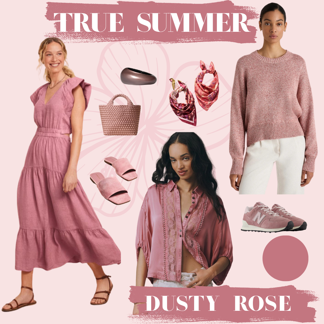
True Summer: Dusty Rose
Dusty Rose offers a soft, romantic neutrality to the True Summer palette. Muted and cool with a gentle grey undertone, it enhances without overpowering. This shade is especially beautiful in flowing fabrics, lightweight knits, and everyday basics—bringing an understated elegance to even the simplest outfit.
Flow Palettes
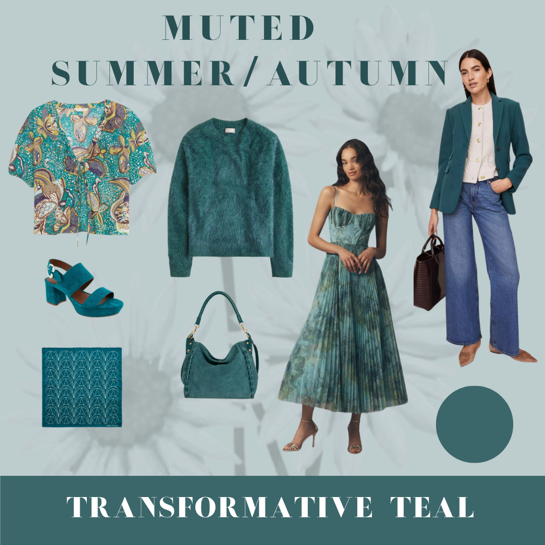
Muted (Summer/Autumn): Transformative Teal
Transformative Teal is a perfectly balanced blend of blue and green, softened with a smoky, muted quality. It feels both grounding and quietly striking—ideal for those who want color without high contrast. This shade works beautifully in elevated basics like trousers, silk blouses, or casual layers.
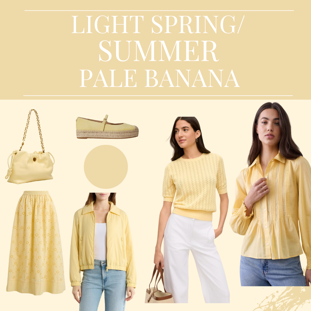
Light (Spring/Summer): Pale Banana
Light Pale Banana
Pale Banana introduces a soft, sunlit yellow that feels airy and optimistic. This delicate hue adds warmth without heaviness, making it ideal for light, tonal dressing. It pairs effortlessly with other soft pastels or warm neutrals, creating a fresh, luminous look.
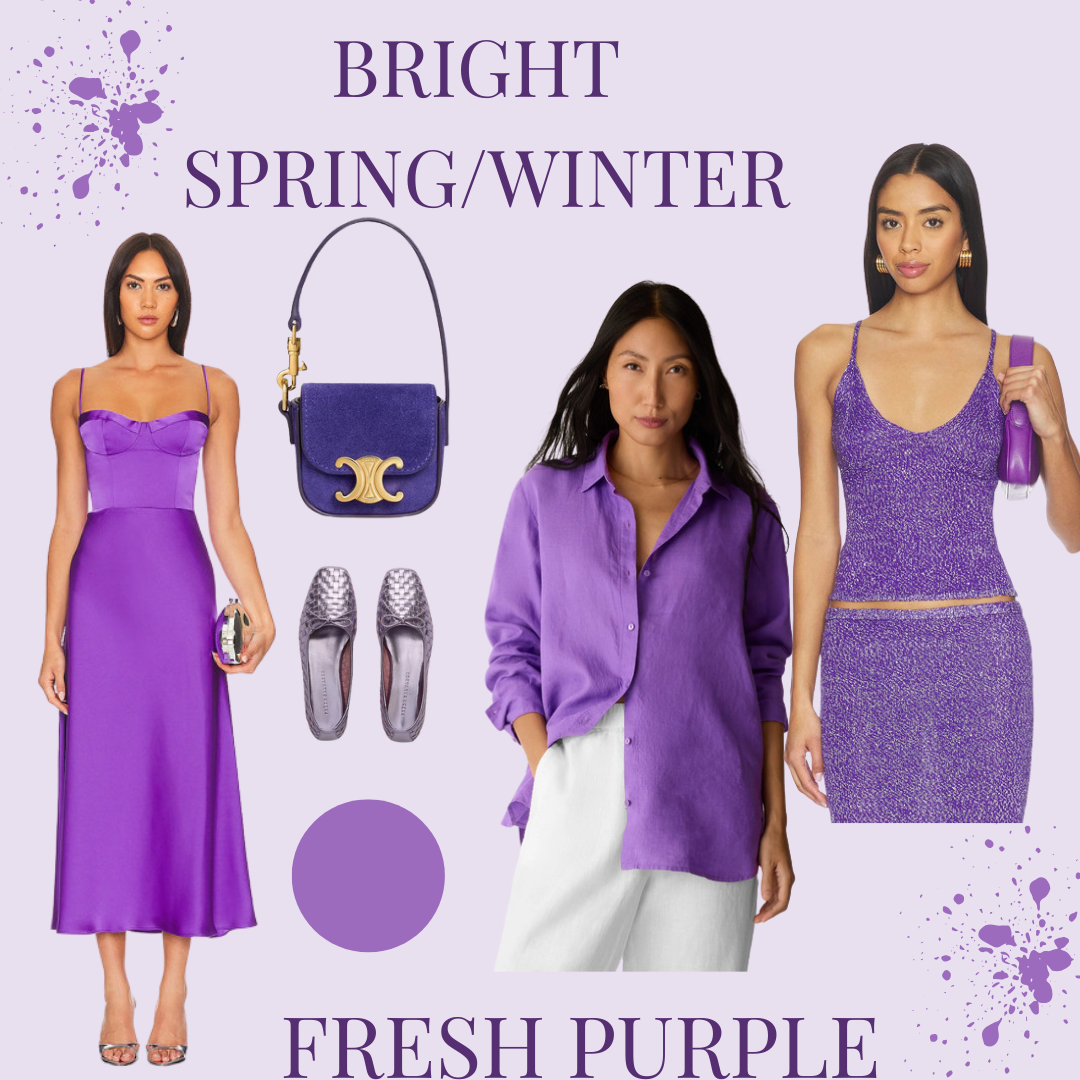
Bright (Spring/Winter): Fresh Purple
Bright Fresh Purple
Fresh Purple is vivid, clean, and full of personality. This high-chroma shade sits right at the intersection of playful and polished—perfect for Bright palettes that thrive on clarity and contrast. Use it as a statement piece or a bold accent to energize your wardrobe.

Cool (Summer/Winter): Dutch Canal
Cool Dutch Canal
Dutch Canal is a refined, medium-toned blue with a distinctly cool, grounded quality. It offers the depth of navy with a slightly lighter, more versatile feel. Ideal for tailoring, denim, and structured pieces, this shade brings quiet sophistication to everyday dressing.
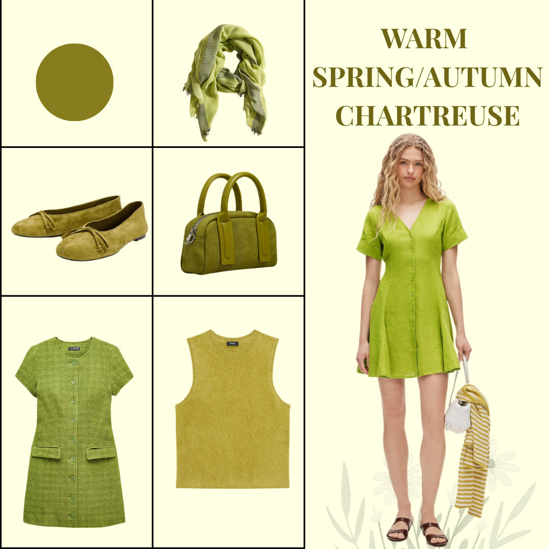
Warm (Spring/Autumn): Chartreuse
Warm Chartreuse
Chartreuse is bold, unexpected, and undeniably alive. This yellow-green hue leans warm and radiant, making it a standout choice for Spring/Autumn blends. Whether worn in small accents or as a statement piece, it adds a fresh, modern edge to your look.
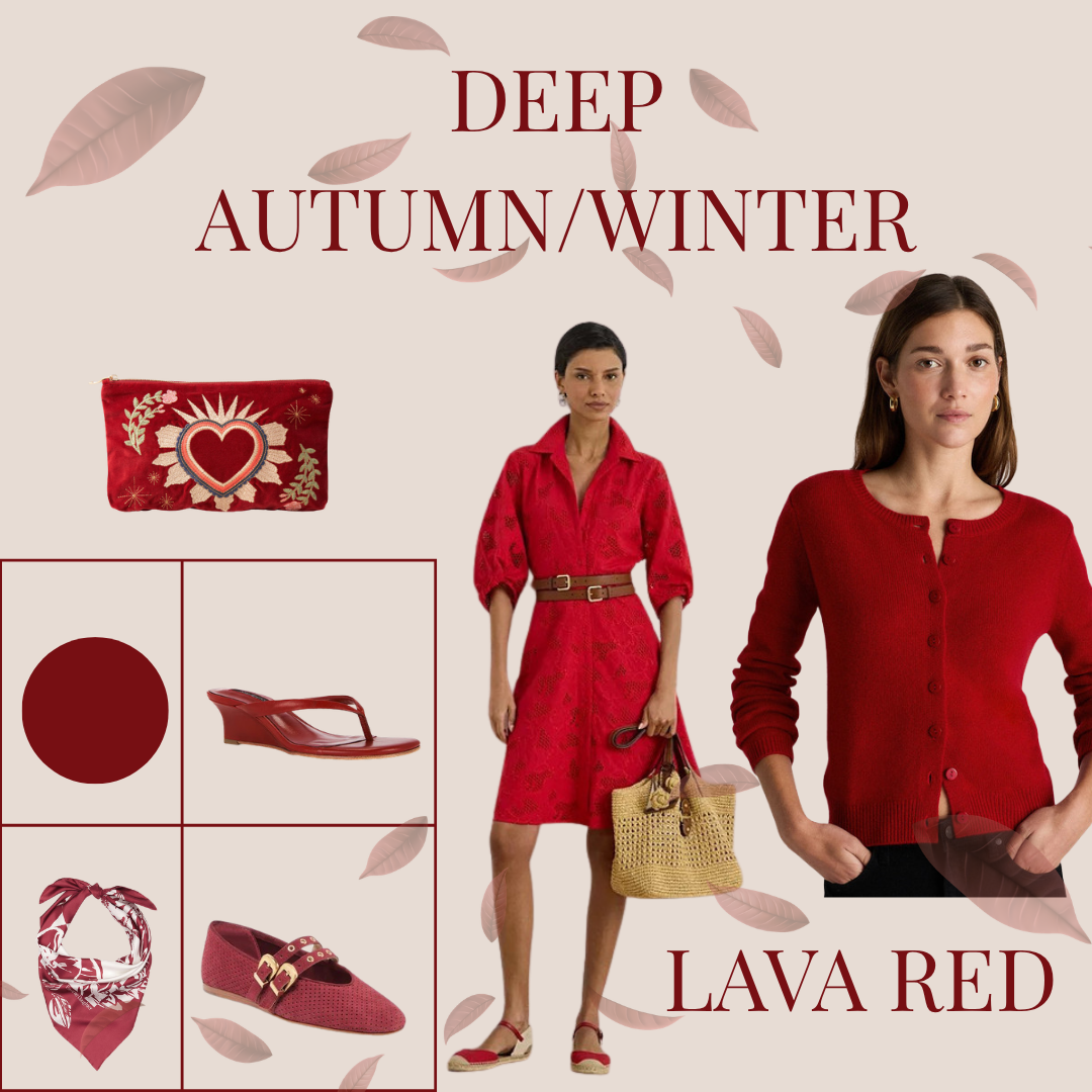
Deep (Autumn/Winter): Lava Red
Deep Lava Red
Lava Red is intense, smoldering, and full of depth. This rich, warm red carries a subtle darkness that makes it feel grounded rather than flashy. It’s especially powerful in structured silhouettes, evening wear, or elevated basics—bringing drama in a refined, wearable way.
By incorporating these trending colors into your wardrobe, you can create looks that feel both current and deeply aligned with your natural coloring. The goal isn’t to chase trends—but to select the ones that harmonize with you.
Want to shop all the pieces I’ve curated in these shades? Click here.
And if you’re ready to discover your own seasonal palette, click here to book your color analysis.